Development
Tools and tips for digital accessibility

Diversity has always been at the heart of our values, so in 2022 we set out to learn more about accessibility and the Web Content Accessibility Guidelines (WCAG) international standard.
In the context of software development, accessibility refers to the practice of designing and building software that is usable by people with disabilities. It might include providing alternative text for images, using keyboard shortcuts, providing text-to-speech / speech-to-text capabilities, and more. A client project allowed us to delve deeper into this subject matter. It interested us so much that we subsequently held a lunch-and-learn for our team, which snowballed into the creation of a new internal Accessibility Team within Osedea. Their directive is to help us keep accessibility top of mind during the development process so that everyone, regardless of their abilities, can access and use the software we create. This includes individuals who are blind or visually impaired, deaf or hard of hearing, mobility-impaired, and cognitively impaired.
In this blog post, we introduce the tools that our devs find helpful for testing the accessibility of our projects, broken down for each stage of feature development.
Developers
Devs have many tools at their disposal that check for accessibility standards throughout the various stages of the development process. Doing this early is especially important, as it saves more time in the long run.
In your IDE (linter)
When developing a new feature in an integrated development environment (IDE), such as Visual Studio Code, a linter, such as the axe Accessibility Linter, can be installed. Linters (also known as lint tools or linting programs), are a type of software that analyzes source code for potential errors or violations of best practices. This linter in particular will catch any basic accessibility issues that may come up as you are coding in HTML, Angular, React, Markdown, or Vue such as the issue of an image not having an alternative text.
In your browser (automated browser testing)
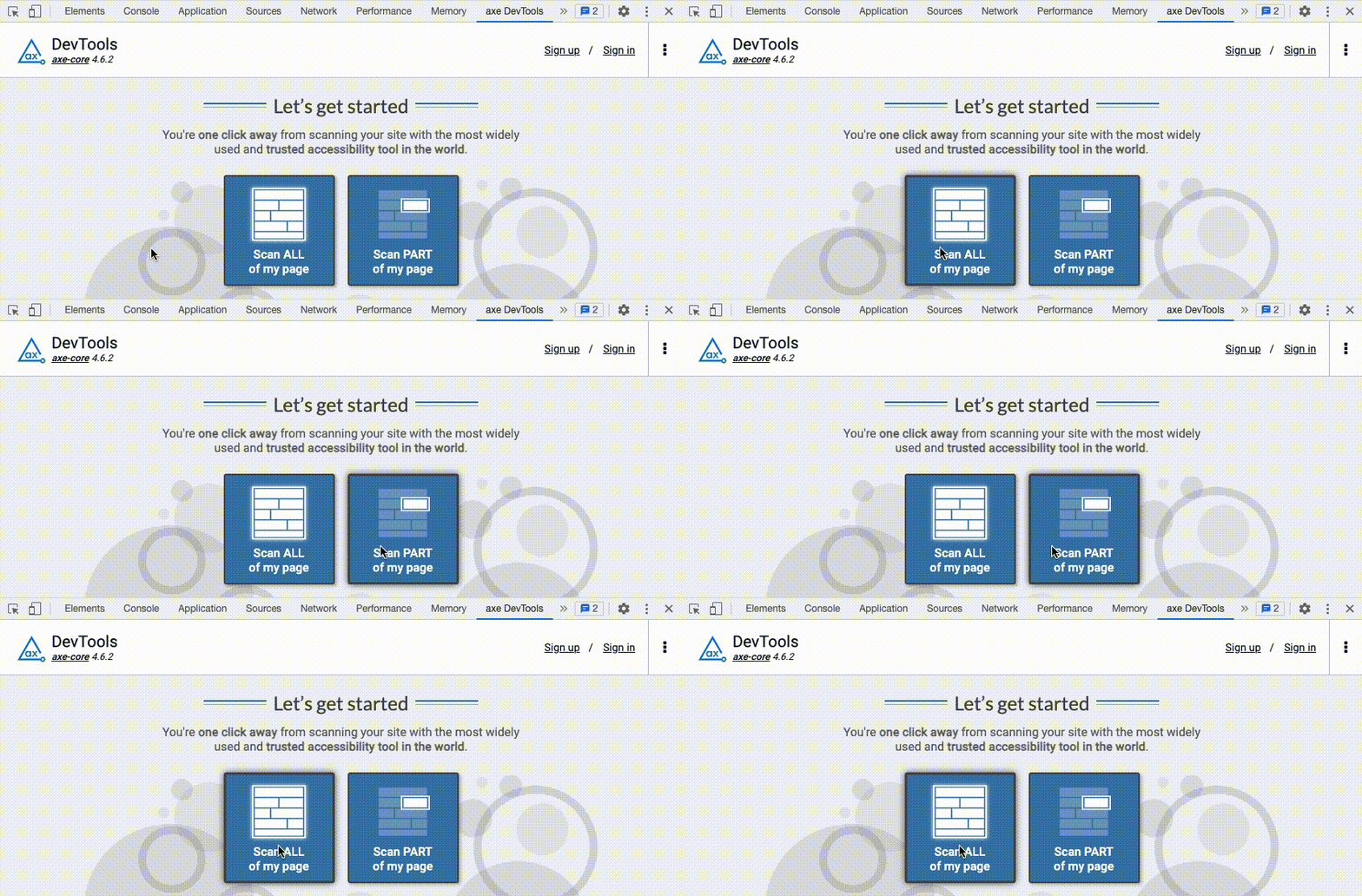
When testing a new feature in a browser, fresh code should be tested for accessibility issues. The axe DevTools Browser Extension can be downloaded and will automatically show up as a new tab in the browser inspector. axe DevTools can scan the entire page or just one part of the page to identify any issues regarding accessibility.

Once the page is scanned, a summary of issues displays which can be filtered by type of issue or by severity. There’s also an option to toggle issues that are related to best practices.
Underneath the summary lists all of the issues found with more details. The first thing to note is the target icon next to the title of an issue. When this icon is clicked, the element on the page that is causing the issue will be highlighted on the page, so the problem may be easily targeted and fixed.

As seen in the image below, an issue can be selected to view more details. Beneath the title of an issue are several important icons.
When the brackets icon (</>) is clicked, the Element tab in the inspector will open and the element in the HTML tree that is causing the issue will be automatically selected so no time is wasted trying to find the associated element.
When the open-in-new-window icon is clicked, a new tab will open leading to a Deque University page with the issue’s related WCAG rule. This new page will usually provide more information about the problem, including the ruleset, the user impact and the WCAG success level. It also explains why the guideline is important, how to fix the problem and some tools are suggested to help solve the issue. For example, the “Elements must have sufficient color contrast” issue, referenced in the image below, brings us to this URL, which provides a color contrast analyzer tool to aid in finding colors that will follow WCAG standards.

General information about the selected issue is included below the icons, such as a description of the problem, the element’s location, the element’s source, and an explanation of how to fix the problem. The solution to an issue usually says what the expected outcome should be. For example, the expected color contrast ratio between colors should be 4.5:1.
At the end of every issue, there are a few tags giving more information about the problem, such as the ones seen in the image below. In this case, the issue was found automatically, the user impact is serious, the level of WCAG success criteria is AA and the guideline number is 1.4.3.

There are 13 WCAG 2 guidelines which detail accessible goals to achieve while developing new features. In this case, we’re looking at guideline number 1.4.3, which is the accessibility guideline for color contrast. For each guideline, there are testable success criteria which determine the level of conformance (A, AA or AAA) to the guideline. Conformance level A is the minimum level and AAA is the highest level.. In this case, we’re looking at a WCAG conformance level of AA.

Continuous integration (automatic testing on CI environments)
Next is setting up automated testing on Continuous Integration (CI) environments for an extra layer of protection to ensure accessibility issues do not make it to production. To do so, there’s a test runner called Pa11y CI, that runs accessibility tests against multiple URLs and automatically reports any issues.
By default, the test runner looks for a .pa11yci config file in the current working directory, which contains URLs or other configuration details needed for the automated testing. This configuration file can be customized for different needs. For example, to only show errors and ignore warnings and notices, or only test for a certain WCAG standard or certain rules.
Reporting
When creating accessibility reports for clients, a great tool is Microsoft Accessibility Insights, which is free to use. This browser extension helps to test websites. It has three different sections: Fastpass, Assessment and Ad Hoc Tools.
The Fastpass section verifies web pages for some common accessibility issues such as ensuring every form element has a label, walks through tabbing the content on the web page to ensure the tab order is logical and raises issues that may need reviewing. This can be used for quick accessibility checks, but isn’t an exhaustive list of criteria to test.
The Assessment section is a full walkthrough of the different criteria that should be tested with a total of 24 steps. Each step describes in detail how to test the corresponding issue and sometimes even provides visual helpers. For example, when testing the step called color as meaning, there is a toggle to allow a visual helper, which will switch the web page to be in greyscale to ensure that no important content on the page is only conveyed with color. The Assessment section of Microsoft’s Accessibility Insights is a great testing tool for developers and for the quality assurance team. Results can even be exported to show a complete report in JSON or HTML.
The last section of Microsoft’s Accessibility Insights tool is Ad Hoc Tools, which consists of seven toggles for different accessibility checks, directly on the web page, such as automated checks, color, landmarks, headings, accessible names, tab stops and issues that may need reviewing.

Conclusion
These are just a few of the tools that are available and designed to help keep accessibility in mind throughout the development process. If you’re worried about meeting accessibility requirements, or if you simply want your product to be usable by a larger audience, don’t hesitate to get in contact with us about your project.

Did this article start to give you some ideas? We’d love to work with you! Get in touch and let’s discover what we can do together.


.jpg)


