Développement
Huit incontournables pour un magicien du CSS


Here are 8 quick CSS magic techniques to help you out as a 2020 front-end wizard. 🎃
Chances are you already know some of these, but hopefully you'll learn something new!
- 1. Instant fluid grid layout
- 2. Truncate strings so they fit on one line
- 3. Truncate text to a specific number of lines
- 4. Instant dark mode with 1 line of CSS
- 5. Smooth scroll
- 6. Sticky header
- 7. Easy hover and active states
- 8. Pure CSS tooltips
- Bonus: Codepen demo of everything combined
1. Instant fluid grid layout
.grid { display: grid; grid-template-columns: repeat(auto-fill, minmax(12rem, 1fr)); grid-gap: 1rem;}
Just a really easy way to have a responsive grid, without having to think about columns and rows at all. Provide a minimum width to your elements and the CSS grid engine takes care of the rest.
Before with just display block:After with 3 properties applied
2. Truncate strings so they fit on one line
Very handy technique to make sure titles and short texts don't wrap on multiple lines.
.truncate { white-space: nowrap; overflow: hidden; text-overflow: ellipsis;}
3. Truncate text to a specific number of lines
Similar as above, but for any desired number of lines!
.line-clamp { display: -webkit-box; -webkit-line-clamp: 3; -webkit-box-orient: vertical; overflow: hidden;}
Here's our cards with 3 lines descriptions.
4. Instant dark mode with 1 line of CSS
Just 1 line of CSS and it does the trick for most cases! Especially useful if you have an existing design and you just want to effortlessly add a dark theme to it.
.dark-theme { filter: invert(1) hue-rotate(180deg);}
Now some elements like pictures and gradients might look off, you can leave them untouched by inverting them again. Here's a more realistic implementation:
.dark-theme,.dark-theme img,.dark-theme .ignore-dark-theme { filter: invert(1) hue-rotate(180deg);}
Now let's add some JS for toggling the class
const toggleTheme = () => { if (document.documentElement.classList.contains('dark-theme')) { document.documentElement.classList.remove('dark-theme'); } else { document.documentElement.classList.add('dark-theme'); }};
Tada!
5. Smooth scroll
Here's another 1-liner to add smooth scrolling to your website.
html { scroll-behavior: smooth;}
Example usage with plain anchor links:
<!-- Add an scroll target --><body> <a id="top" href="#bottom">Scroll to bottom</a> <!-- Site content... --> <a id="bottom" href="#top">Scroll to top</a></body>
6. Sticky header
header { position: sticky; top: 0;}
Difference with position: fixed; is that position position: sticky; will keep it's place in the document flow, meaning that the content will not shift upwards like it would if you used fixed. Also, position: sticky; is not necessarily fixed to the viewport, it will simply try to remain within the view port based on the top, left, right and bottom values you give it, within the scrolling container.
Here's an example with top: 1rem;:

7. Easy hover and active states
There is nothing magical about this one but if you want quick hover and active states for clickable elements, you can easily achieve good enough results with this, which is what you would manually do anyways:
a:hover,button:hover { filter: brightness(0.9);}a:active,button:active { filter: brightness(0.85);}
8. Pure CSS tooltips
Let's finish off with simple tooltips you can easily add to improve the user experience, with just CSS!
.tooltip { position: relative;}.tooltip:hover::before { opacity: 1;}.tooltip::before { opacity: 0; display: block; content: attr(aria-label); background-color: #353535; color: white; font-family: Arial, Helvetica, sans-serif; font-size: 0.875rem; text-decoration: none; white-space: nowrap; padding: 0.5rem; border-radius: 0.25rem; pointer-events: none; position: absolute; top: 100%; left: 100%;}
You can add directions for the tooltip to appear in as such:
.tooltip.left::before { left: auto; right: 100%;}
Usage:
<span class="tooltip" aria-label="Tooltip content goes here!"> Hover for more info. </span>
Bonus: Codepen demo of everything combined
If you want to discover other tips and tricks, take a look at the software development section of our blog.
Photo credit: Michał Kubalczyk

Did this article start to give you some ideas? We’d love to work with you! Get in touch and let’s discover what we can do together.
Further Reading
Exploiter les données de votre organisation avec les bases de données vectorielles

Chez Osedea, nous sommes constamment à l'avant-garde des technologies émergentes, et nous avons une perspective unique sur les tendances en matière d'adoption technologique parmi notre base de clients diversifiée. Ces derniers mois, l'IA a fait son entrée dans les médias grand public grâce à ChatGPT. Depuis lors, les outils et le soutien au développement de l'IA ont explosé. Il y a quelques semaines à peine, le Dr Andrew Ng, un leader mondialement reconnu en IA, a prononcé un discours sur les opportunités offertes par l'IA, mettant en évidence l'importance de l'intégration de l'IA dans le flux de travail de votre organisation.
BEARING.ai, la première entreprise à exploiter la puissance de l'IA générative dans l'industrie maritime, est un excellent exemple de la rapidité avec laquelle l'adoption de l'IA peut apporter d'énormes avantages. En utilisant leurs données pour surveiller, prévoir, simuler et optimiser, les clients de BEARING.ai ont réalisé des améliorations substantielles des performances des navires tout en réduisant simultanément les coûts de carburant et les émissions de carbone, contribuant ainsi à un environnement plus vert. Des opportunités similaires ne sont pas des rêves lointains ; elles sont à portée de main. L'IA est prête à être adoptée, et la clé pour en exploiter tout son potentiel réside dans l'utilisation des données de votre organisation.
Les avantages de la centralisation des données
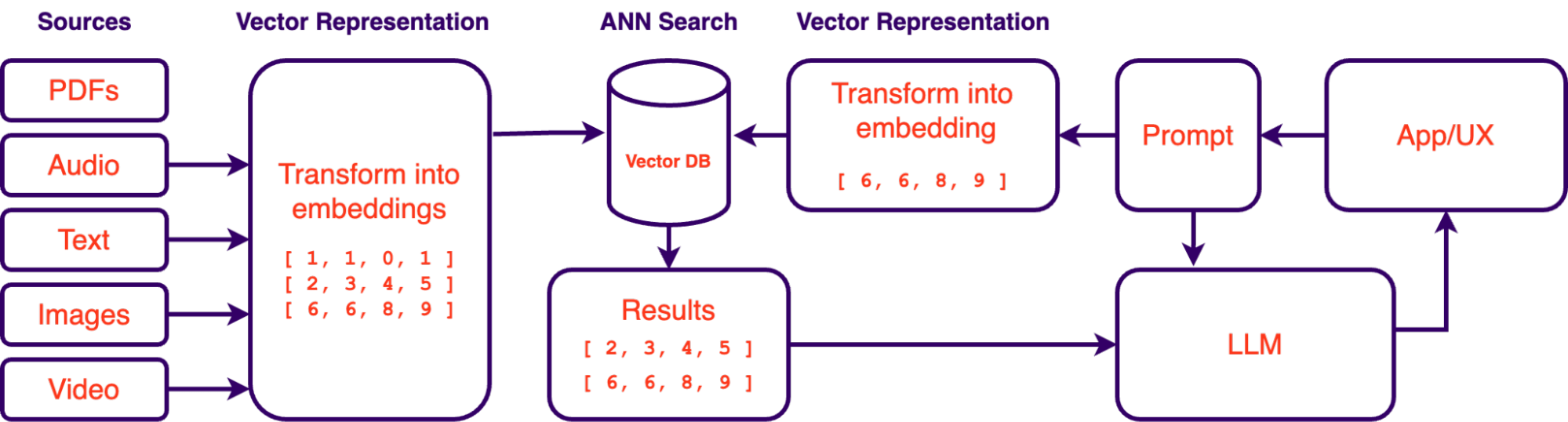
Pour de nombreuses entreprises établies, les données s'accumulent depuis des années dans divers départements et systèmes. Les PDF, les images, les présentations, les e-mails, l'audio, la vidéo et les analyses regorgent d'informations (et sont des actifs importants lorsqu'ils sont exploités correctement). La première étape vers l'adoption de l'IA au sein de votre organisation consiste à centraliser vos données. La centralisation (la consolidation de diverses sources/emplacements dans un seul référentiel ou système) en mettant en place une plateforme de gestion unifiée des données ou en intégrant des systèmes existants grâce à des solutions middleware offre de nombreux avantages :
Base de connaissances alimentée par l'IA : Une fois centralisées, les données peuvent être organisées et indexées de manière efficace grâce à l'aide de modèles d'incorporation. Ces modèles sont formés pour extraire les informations les plus significatives de vos données non structurées. En indexant vos données de cette manière, les grands modèles de langage tels que GPT-4 peuvent étendre leur contexte avec le contexte commercial de votre organisation pour évoluer en un assistant complet et omniscient. Cette approche innovante est connue sous le nom de génération augmentée de récupération (RAG) avec des bases de données vectorielles, un concept que nous aborderons bientôt.
Formation de modèles prédictifs : Le pool de données consolidé devient une ressource précieuse pour la formation de modèles d'IA. Les analyses prédictives, les prévisions et l'analyse des tendances deviennent des objectifs réalisables lorsque vous capitalisez sur les données historiques de votre organisation.
Avantages en matière de sécurité : La centralisation des données offre une infrastructure de sécurité plus robuste pour protéger les informations sensibles. Elle permet un meilleur contrôle d'accès et une meilleure auditabilité, réduisant ainsi le risque de violations de données.
Sauvegardes plus faciles : Les données centralisées sont plus faciles à sauvegarder que les données provenant de sources disparates. Cela simplifie les mesures de protection des données, garantissant que les informations critiques sont préservées en toute sécurité et récupérables en cas de perte de données.
Redondance : La mise en place de la redondance, telle que la mise en miroir ou la réplication des données, devient plus réalisable avec des données centralisées. La redondance améliore la disponibilité des données et la tolérance aux pannes, réduisant les temps d'arrêt et assurant la continuité des activités.
Création d'une base de connaissances alimentée par l'IA
Comme mentionné précédemment, les systèmes de génération augmentée de récupération (RAG) ont pris de l'importance en tant que solution précieuse pour interroger les données d'une organisation à l'aide de grands modèles de langage (LLM). Les systèmes RAG permettent d'interroger les données en langage naturel. Fondamentalement, cela vous permet de "parler" à vos données de la même manière que vous parlez à ChatGPT. L'accessibilité des LLM au cours des derniers mois a rendu cette approche beaucoup plus faisable, c'est pourquoi cette approche de l'exploration des données gagne rapidement du terrain. Cependant, le succès de ces systèmes dépend non seulement des LLM et de l'ingénierie des invites, mais aussi de la vectorisation et de l'indexation correctes des données. C'est là que les bases de données vectorielles et les incorporations jouent un rôle crucial.
Qu'est-ce que les incorporations vectorielles ?
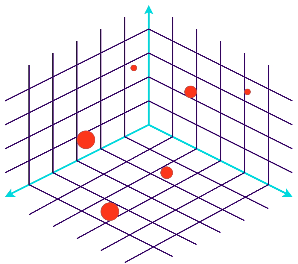
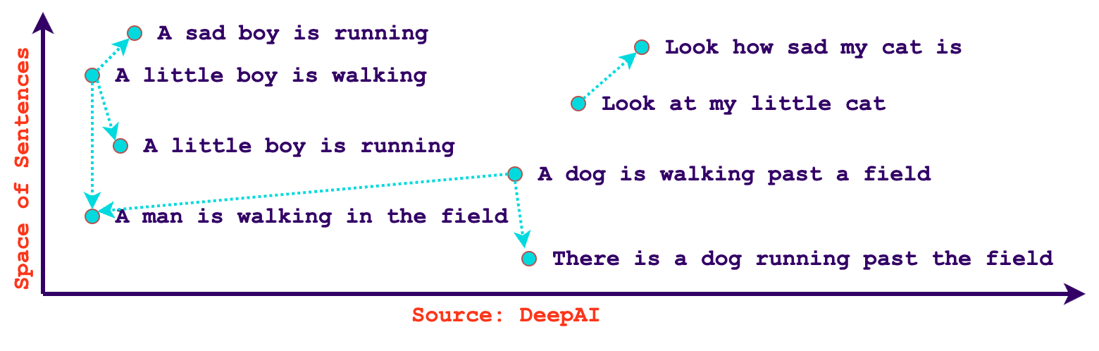
Dans le contexte de l'IA et de l'apprentissage automatique, les incorporations vectorielles sont une représentation numérique de la sémantique d'une entité. Ces représentations capturent les caractéristiques essentielles et les relations au sein des données, facilitant ainsi le traitement et la compréhension par les algorithmes d'IA. Les incorporations sont essentielles pour des tâches telles que le traitement du langage naturel, les systèmes de recommandation et la reconnaissance d'images. Grâce aux incorporations, nous pouvons rapidement trouver du contenu similaire en fonction de la similitude. De plus, les incorporations ne se limitent pas aux seuls textes, il est possible de créer des vecteurs à partir d'images, d'audio, de vidéos ou de tout type de données en utilisant des modèles d'encodeur formés pour extraire leurs informations significatives. Certains modèles, comme le modèle d'incorporation de texte d'OpenAI-ada-002, sont même agnostiques à la langue, ce qui signifie qu'ils peuvent comprendre la similitude dans diverses langues de manière native.
Qu'est-ce qu'une base de données vectorielle ?
Une base de données vectorielle est une base de données spécialisée conçue pour stocker et récupérer efficacement des incorporations vectorielles en haute dimension, ce qui les rend idéales pour les applications d'IA et d'apprentissage automatique. Elles utilisent des algorithmes de recherche d'approximation du plus proche voisin (ANN) pour mesurer la distance entre les incorporations, ce qui donne une liste classée de vecteurs voisins.
À titre d'exemple, Spotify utilise des bases de données vectorielles depuis un certain temps pour comparer les goûts musicaux des utilisateurs. Ils détaillent également comment ils ont utilisé des incorporations pour interroger leurs épisodes de podcast dans leur article de blog : Présentation de la recherche de langage naturel pour les épisodes de podcast. Ils sont même allés jusqu'à créer leur propre bibliothèque ANN !
Des cas d'utilisation pour les bases de données vectorielles
Les bases de données vectorielles conviennent parfaitement à un large éventail de cas d'utilisation impliquant la recherche de similitudes, les systèmes de recommandation et l'analyse des données dans des domaines tels que l'apprentissage automatique, le traitement du langage naturel, la vision par ordinateur, et bien d'autres. Voici quelques cas d'utilisation courants pour les bases de données vectorielles :
Systèmes de recommandation : Les bases de données vectorielles sont souvent utilisées dans les systèmes de recommandation pour trouver des articles ou du contenu similaire à ce avec quoi un utilisateur a interagi dans le passé. Cela peut s'appliquer au commerce électronique, à la recommandation de contenu, et aux plateformes de musique ou de streaming vidéo.
Recherche basée sur le contenu : Dans les plates-formes de contenu multimédia, les bases de données vectorielles permettent la recherche basée sur le contenu pour les images, l'audio et les fichiers vidéo. Les utilisateurs peuvent rechercher du contenu avec des caractéristiques visuelles ou auditives similaires.
Détection d'anomalies : La détection d'anomalies dans les données de haute dimension, telles que les journaux de trafic réseau, les données de capteurs ou les transactions financières, peut être effectuée à l'aide de bases de données vectorielles. Les points de données inhabituels peuvent être identifiés en les comparant à un ensemble de vecteurs normaux.
Filtrage collaboratif : Les algorithmes de filtrage collaboratif peuvent utiliser des bases de données vectorielles pour trouver des utilisateurs ayant des préférences similaires et recommander des éléments en fonction du comportement d'utilisateurs similaires.
Mémoire à long terme : Les bases de données vectorielles peuvent être utilisées pour stocker les générations de réponses passées d'un LLM. Ces incorporations peuvent être rappelées pour améliorer davantage le contexte d'un modèle de langage avec son contexte passé.
Regroupement : Dans les bases de données vectorielles, le regroupement peut être appliqué pour organiser les données en groupes distincts, facilitant ainsi l'identification de motifs et de similitudes au sein de l'ensemble de données.
Mesure de la diversité : Dans les bases de données vectorielles, la mesure de la diversité peut être appliquée pour évaluer l'étendue et l'inclusivité des recommandations, garantissant une sélection équilibrée d'articles ou de contenu pour répondre à un large éventail de préférences ou de sujets d'utilisateurs.
Les écueils des modèles d'incorporation et des bases de données vectorielles
Bien que les incorporations soient puissantes, elles ne sont pas sans leurs défis. Il est important de connaître les écueils potentiels, tels que les biais dans les données d'entraînement. Par exemple, OpenAI explique dans sa documentation comment un modèle peut associer de manière plus marquée des noms européens américains à un sentiment positif par rapport aux noms africains américains. De plus, les modèles d'incorporation ont des dates de coupure sur leurs données d'entraînement, ce qui signifie que certaines données peuvent varier sémantiquement au fil du temps (par exemple, la popularité d'une célébrité). Le choix des bonnes techniques d'incorporation et des paramètres est essentiel pour obtenir des résultats optimaux, et des techniques appropriées de prétraitement des données doivent être appliquées pour exploiter correctement les incorporations.
Les bases de données vectorielles ne sont que la moitié de la solution
Bien que les bases de données vectorielles et les incorporations soient des composants essentiels de l'adoption de l'IA, il est essentiel de reconnaître qu'ils font partie d'un écosystème plus vaste. La création d'une infrastructure d'IA robuste implique de s'attaquer à d'autres aspects clés tels que le prétraitement des données, la sélection de modèles, l'ingénierie des invites et les stratégies de déploiement. Les bases de données vectorielles sont une pièce puissante du puzzle, mais elles ne sont pas la solution complète.
L'un des problèmes récurrents avec les LLM et l'IA en général est le compromis en termes de précision. Pendant des siècles, les ordinateurs ont été binaires et déterministes. Bien que les bases de données vectorielles puissent représenter une avancée monumentale dans l'exploration des connaissances, elles doivent encore être combinées avec des architectures structurées traditionnelles pour offrir une expérience de recherche ultime. Certaines plateformes, telles qu'Azure Cognitive Search et Elastic Search, travaillent activement à l'amélioration et à l'ajustement des recherches hybrides en utilisant la fusion des classements réciproques (RRF) pour mélanger les classements obtenus. Elastic s'attaque également à d'autres problèmes liés aux bases de données vectorielles, tels que la confidentialité des données et le contrôle d'accès basé sur les rôles (RBAC). Du côté de l'ingénierie des invites, divers cadres tels que guidance ai, Langchain et LMQL sont en cours de développement pour fournir une manière robuste de transformer les données des LLM en réponses structurées significatives. Inutile de dire que nous vivons des moments passionnants, et les architectures RAG émergentes s'améliorent chaque jour.
Chez Osedea, nous reconnaissons le potentiel des bases de données vectorielles, des incorporations et de l'IA pour provoquer des changements transformateurs au sein des organisations. Nos services de développement complets sont conçus pour donner à votre organisation les moyens d'exploiter ses données et de réaliser pleinement le potentiel de l'IA. Que ce soit la centralisation des données, la mise en place de bases de données vectorielles ou la navigation dans les complexités de l'adoption de l'IA, Osedea est là pour être votre partenaire de confiance sur la voie du succès axé sur les données. Soyez assuré que nous restons à l'avant-garde des technologies émergentes et que nous nous engageons à suivre les dernières avancées dans le domaine.
Modèles réactifs de domaines riches en React + Typescript

Au cours des dernières années, nous avons vu le monde des frameworks Web exploser. De nombreux frameworks ont émergé, tous essayant apparemment de résoudre le même problème. C'est-à-dire : comment mettre fin au problème de complexité dans nos applications frontend? Chaque framework traite cette question de manières différentes et possède ses propres avantages et inconvénients. Au fur et à mesure que les entreprises s'enferment dans des spécifiques frameworks stacks, elles commencent à embaucher des développeurs de logiciels «experts» dans ces frameworks. Une recherche rapide sur Linkedin révèle que Redux est un besoin quasi fondamental pour certaines entreprises au même titre que React.
Mon équipe et moi, nous avons exploré différentes manières de gérer la complexité croissante de notre stack. L'une des raisons derrière cette complexité est sans aucun doute l'étendue de la business logic de notre frontend. Nos applications frontend nécessitent un feedback immédiat aux utilisateurs. Nos utilisateurs se trouvent potentiellement dans des régions éloignées avec une connexion Internet plus lente, et il est impossible d'attendre les backends pour la business logic. L'application configure les données en temps réel et appelle les backends pour permettre de visualiser ces données. La configuration des données est rarement affectée au stockage et, par conséquent, l'aller-retour vers le backend n'est pas nécessaire. Avec notre interface contenant beaucoup de business logic, nous avons commencé à nous demander : pourquoi est-il si difficile d'ajouter de nouvelles fonctionnalités à nos besoins commerciaux croissants ?
Dans les ressources disponibles, résoudre la complexité de la business logic peut être faite de multiples façons. La conception pilotée par le domaine (DDD) semble être le chouchou de plusieurs. Surtout si vous avez un fort état d'esprit orienté objet. Comme je l'ai mentionné précédemment, une grande quantité de business logic se trouve dans notre frontend, en particulier une frontend basée sur React. Jusqu'à aujourd'hui, nous voulions tout coder dans l'écosystème React, avec très peu d'outils personnalisés, nous avons donc utilisé Redux en raison de son intégration avec React. Cette approche est correcte, cependant, vous vous retrouvez avec un modèle de domaine anémique, généralement uniquement un type interface. Bien que les modèles anémiques fonctionnent bien, vous vous retrouvez alors avec de nombreux «services» ou «fichiers d'assistance» Redux pour gérer la business logic de ces modèles. Ce qui a pour conséquence la répartition du business logic sur de nombreux fichiers.
Il y a une question que je me posais en boucle au cours des 6 derniers mois lors du développement d'un nouveau sous-ensemble de notre application. Avec une interface monolithique, enfermée dans un tech stack, 2 versions majeures derrière, et un spaghetti complexe de fichiers d'aide ; Je me suis demandé, pourquoi en sommes-nous rendu à ce point en premier lieu? Comment réduire l'enfer des versions ? Comment intégrons-nous la business logic répartie dans maintes fichiers d'assistance ? Certains de nos fichiers d'assistance comportaient 3 000 lignes, ils contenaient la business logic de nos 15+ entités. Comment s'est-on rendu ici? Après avoir fait un petit pas en arrière, notre équipe a identifié Redux comme étant l'une des causes. Redux suggère des modèles de domaine anémiques et donc de séparer la business logic en fichiers d'assistance. Nous voulions savoir s'il existait un moyen d'intégrer le rich domain dans React+Redux de manière à ne pas avoir à réécrire l'intégralité de notre frontend ou à créer nos propres frameworks. Nous avons parcouru Internet à la recherche de réponse, cependant ce fut en vain.
Permettez-moi de prendre du recul pour clarifier les modèles de domaine anémique par rapport aux modèles de domaine riches si vous n'êtes pas familier avec les principes DDD. Tout le monde a des définitions différentes de la conception pilotée par domaine. Pour les besoins de cet article, DDD est un moyen de mapper le code aux concepts du monde réel. Les principes importants de DDD incluent la création de modèles de domaine, c'est-à-dire une classe (généralement) qui définit de manière unique un concept du monde réel. Ci-dessous, j'aborde deux variations importantes de ces modèles de domaine.
Domaine anémiques
Les modèles de domaine anémique sont des objets sans aucune business logic associée à leurs définitions. Ils sont généralement représentés dans TypeScript par une interface unique, connue sous le nom d'objet de transfert de données (DTO). L'interface décrit la forme de l'objet JavaScript, en utilisant la vérification de type TypeScript, nous pouvons garantir une utilisation correcte. Cette interface n'est connectée à aucun autre modèle et n'a que peu ou pas de méthodes pour la business logic. Il n'a certainement pas ses propres transitions d'état. Voici un exemple typique en TypeScript :
export interface MyPetShopDTO {
   readonly id: number;
   readonly storeName: string;
   readonly pets: MyPetDTO[];
}
C'est parfait, cela fonctionnerait avec Redux et React tel quel. Cependant, il n'a aucune business logic. Que se passe-t-il si vous souhaitez mettre à jour le nom de ce modèle dans une application React+Redux typique ?
Pour propager vos modifications dans Redux, vous devez :
- Créer un sélecteur Redux pour obtenir ce modèle dans vos composants
- Ajouter un event listener à un input dans un composant
- Envoyer un event à Redux pour mettre à jour ce nom dans son état
- Attraper cet event dans Redux à l'aide d'une action Slice
- Trouvez l'entité dans votre état Redux, généralement en utilisant un ID d'entité
- Recréez un objet pour les entités (à l'aide d'opérateurs de propagation) dans votre état, sinon Redux ne laisse pas React re-render
- React re-rend l'arbre entier, en passant par la réconciliation React pour savoir quels props ont changé et quel composant mettre à jour.
- Si un props change, re-render tous les «enfants» jusqu'à votre composant. Peu importe si ce nom est utilisé partout ou dans une infime partie de votre application.
Ça sonne douloureux à écrire, n'est-ce pas! Dans ce cas, tout se travaille, pour un exemple de base d'un changement de nom. Comparons maintenant cela à la façon dont vous désignerez généralement un changement de variable en JavaScript sans framework.
myPetShop.storeName = 'Montreal Pets'
Une application React+Redux typique nécessite plus de 8 étapes pour accomplir quelque chose que JavaScript fait en une seule étape. Non seulement cela, mais les développeurs doivent être conscients de toutes les étapes mentionnées ci-dessus. En raison de leurs grandes complexités, l'industrie du logiciel crée souvent un passe-partout (boilerplate) à copier-coller de l'ensemble de la hiérarchie Redux. Les développeurs peuvent ensuite copier-coller les extraits dont ils ont besoin pour exécuter le code. Ils ne s'arrêtent pas pour analyser le flux de code complet, à travers ces bibliothèques tierces. Sans comprendre le flux complet, comment pouvons-nous attendre des développeurs qu'ils écrivent des tests unitaires ? Surtout lorsque vous faites des choses insignifiantes comme changer le nom d'un animal de compagnie. Dans React + Redux, cela nécessiterait près de 15 lignes de code de test unitaire avant chaque clause? Et c'est sans qu'aucune business logic n'ait encore été testée. C'est comme si nous nous plongions tête baissée dans un jargon de framework qui s'est accumulé au fil du temps sans prendre de recul et sans réfléchir à ce que serait la meilleur route à emprunter.
Modèles de domaine anémiques - Business logic
Ajoutons un peu de business logic à notre modèle anémique. Les employés de l'animalerie peuvent ajouter ou supprimer des animaux qui sont disponibles pour adoption. Ces animaux ont diverses options de configuration remplies via un modal.
export const slice = createSlice({
  name: 'petStoreSlice',
  initialState,
  reducers: {
    addPet(state, action: PayloadAction<MyPetDTO>) {
      const hasPet = state.petStore.pets.find(
        (pet) => pet.id === action.payload.data.id
      );
      if(!hasPet) {
        const defaults = getPetDefaults(action.payload.data);
        const newPet = {...defaults, ...action.payload.data);
        state.petStore = {
          ...state.petStore,
          pets: [...state.petStore.pets, newPet]
        }
      }
    },
Modèles de domaine riches (rich domain models)
Et si nous vivions dans un monde où nos données et notre business logic sont au même endroit. Agnostique de tout framework. La possibilité de les importer dans des stacks d'applications frontend. JavaScript est JavaScript, il peut être utilisé quel que soit le framework de rendu utilisé. Les tests unitaires de notre application deviennent beaucoup plus faciles, vous n'avez plus besoin de gérer tous ces frameworks. La séparation des préoccupations est plus facile à appliquer si vous planifiez correctement vos modèles en fonction de la séparation des préoccupations et des limites du contexte.
Une bonne compréhension de vos entités et des interactions entre elles est nécessaire, en plus du Contexte qui les entoure… Mais c'est une discussion pour un autre jour. Généralement, un responsable technique/développeur d'un projet aura effectué l'analyse en amont et déterminé les modèles, leurs interactions et leur business logique. Même si ce n'est pas le cas, une approche orientée objet contribuera considérablement à la flexibilité future de vos applications grâce à l'encapsulation et à l'héritage.
À quoi ressemblerait un modèle de domaine riche dans TypeScript?
export interface PetStoreDTO {
   id: number;
   storeName: string;
   pets: PetDTO[];
}

export interface IPetStore extends PetStoreDTO {
   pets: IPet[];
   addPet: (newPet: IPet) => void;
   removePet: (pet: IPet) => void;
   createOffspring: (parent1: IPet, parent2: IPet) => IPet;
}
Remarquez comment nous gardons le PetStoreDTO du modèle de domaine anémique, mais nous créons une nouvelle interface qui l'étend. Dans cette nouvelle interface, nous indiquons que les implémentations concrètes contiendront 3 fonctions. Ajoutez un animal de compagnie, supprimez un animal de compagnie et créez une progéniture. Notez que le tableau `pets` a été remplacé dans cette interface par un nouveau type : le type IPet. Le DTO de l'animalerie ne contient que le JSON brut des animaux, mais pas les modèles basés sur les classes. Cependant, l'interface de l'animalerie (et/ou le modèle basé sur les classes de l'animalerie) a des animaux de compagnie comme modèles. Pour remédier à ce changement entre les DTO et les modèles, les propriétés de l'interface sont remplacées.
L'implémentation concrète de cette classe pourrait ressembler à :
class PetStore implements IPetStore {
   id: number;
   storeName: string;
   pets: IPet[] = [];

   addPet(newPet: IPet) {
       this.pets.push(newPet);
   }
}
Remarquez à quel point c'est simple! Vous pouvez le compiler de TypeScript à JS et l'importer dans n'importe quel autre projet JS.
Que du plaisir, mais à quoi cela ressemblerait-il avec React ?
Eh bien, c'est là que les choses deviennent intéressantes. React n'aime pas les instances de classe. React utilise un algorithme appelé «Réconciliation» pour savoir quels accessoires ont changé et quels composants doivent être rendus (render) à nouveau. Il sait quels props ont changé en examinant les références d'objets (similaires aux pointeurs C) dans leurs props, c'est-à-dire une comparaison superficielle. Lors de l'utilisation d'entités basées sur des classes, la modification des valeurs au sein de ces classes ne modifie pas la référence de l'entité de classe. Par conséquent, React ne considérait pas cela comme un changement d'accessoire et ne le restituera donc pas.
Jetons un coup d'œil à cet exemple :
// Instantiated somewhere else
const petStore = new PetStore({
   id: uuidv4(),
   storeName: 'Montreal Pets',
   pets: []
});

// React Component:
const PetStoreHome: React.FC = () => {
   const onAddPet = () => {
       petStore.addPet(new Pet());
   }
   return (
       <div>
           <p>Pet store: ${petStore.storeName}</p>
           <PetList petStore={petStore} />
           <button onClick={onAddPet}>Add Pet</button>
       </div>
   );

};
Dans ce cas, nous instancons une nouvelle classe pour contenir le petStore, potentiellement dans un autre fichier (ex : un fichier de service, un référentiel, peut-être Redux). Si nous apportons des modifications à petStore, React ne restituera pas ce composant. De plus, PetList ne restituera pas même si nous appelons addPet sur petStore. Les instances basées sur les classes dans React sont problématiques car l'algorithme de réconciliation ne vérifie que l'égalité des références.
Le modèle PetStore est un modèle de domaine riche car il contient un business logic (ex. addPet) mais il n'est pas « réactif » dans React. La modification de l'une des valeurs du modèle n'entraîne aucun nouveau rendu. Nous avons trouvé un moyen d'utiliser des modèles de domaine riches et de faire en sorte que React… réagisse aux changements.
Modèles réactifs de domaine riche dans React
Pour ce faire, nous avions besoin d'un moyen de connaître toutes les modifications apportées à une classe de modèle. La modification d'une propriété unique ou d'une myriade de propriétés sur une classe devrait entraîner le rendu de tout ou partie des composants de réaction pour refléter ces modifications. Cependant, tous les composants de l'arborescence DOM/React n'auront pas besoin d'être rendus à nouveau. Un changement dans le nom du magasin ne devrait pas provoquer de nouveaux rendus dans la PetList. Pour tenir compte des changements effectués sur une classe de modèle, nous utilisons l'API Proxy et une classe de base qui sera étendue par nos modèles.
class PetStore extends BaseModel implements IPetStore {
   ...
   constructor(petStore: PetStoreDTO) {
       super();

       ...
   }
La seule chose qui change est la directiveextends et le super appel dans le constructeur. Pour le reste, tout semble identique.
Nous avons également créé un React Hook qui se lierait au modèle de base et enregistrerait un rappel sur les modifications de propriétés :
// React Component:
const PetStoreHome: React.FC = () => {
   useModelUpdate(petStore, 'storeName');
   ...
}
Le hook ne met à jour ce composant que si la propriété 'storeName' du modèle petStore est modifiée. Étant donné que le PetList ne nécessite que le petStore en tant qu'accessoire, qui ne change jamais de référence entre les rendus, le composant PetList n'est pas restitué, ce qui améliore considérablement les performances.
Si nous voulons ajouter un animal de compagnie, le composant PetStoreHome n'a pas besoin d'être rendu à nouveau, seul le composant PetList doit être rendu à nouveau. Cela peut être accompli en ajoutant un nouvel enregistrement de hook dans le composant PetList:
const PetList: React.FC<PetListProps> = ({petStore}) => {
   useModelUpdate(petStore, 'pets'); // array changes (ex: push, pop, splice, etc)
   return (
       <ul>
           {petStore.pets.map((pet) => <PetDetails pet={pet} />)}
       </ul>
   );
};
Si un animal change de nom, seuls les PetDetails doivent être restitués à l'aide d'un nouvel hook enregistrement. Toute autre modification apportée à «animal de compagnie» (par exemple, les modifications d'identifiant) ne provoquerait pas de nouveau rendu :
const PetDetails: React.FC<{ pet: IPet}> = ({ pet }) => {
   useModelUpdate(pet, 'name');
   return (
       <li>{pet.name}</li>
   );
}
Comme vous pouvez l'imaginer, il s'agit d'un moyen extrêmement puissant de rendre vos composants React en contrôlant explicitement le flux de mise à jour de React. Exiger uniquement que les composants soient restitués si les propriétés qu'ils utilisent changent. Peut-être que parfois vous n'aurez même pas besoin d'un nouveau rendu si les propriétés d'une classe changent. Quelques propriétés de certains modèles n'ont pas de représentation visuelle et ne sont utilisées qu'en interne pour les calculs de propriétés dérivées, ou elles ne doivent être appliquées que lors d'un event.
Un monde sans Redux en React
Bien qu'il existe différentes manières de gérer l'état dans React, un package populaire est React-Redux. Il s'agit d'un package de gestion d'état global. Son objectif principal est de rationaliser la gestion de l'État. C'est un paquet assez gros qui nous oblige à nous développer de certaines manières. Dans une application React + Redux typique, vous pouvez trouver des centaines, voire des milliers de hooks useDispatch et useSelectoréparpillés dans le code. Chaque modèle anémique a des dizaines d'actions, de réducteurs d'état, de thunks et de fonctions de sélection.
Tester les Slices devient extrêmement difficile car nous devons nous souvenir de la séquence useSelector pour simuler correctement l'implémentation ou nous devons créer un magasin entier pour nos tests unitaires. Mon équipe a pris un peu de temps pour maîtriser les tests des Slices et nous avons fini par abandonner les Slices pour les tests unitaires au profit des tests Cypress end-to-MockAPI.
Avec des modèles de domaine riches, nous pouvons nous débarrasser des actions, des réducteurs d'état et des fonctions de sélection. Après avoir supprimé la plupart des principes de base de redux, il ne nous restait plus que des thunks. Cela m'a laissé deux questions : comment puis-je me débarrasser de ces thunks et où gardons-nous nos modèles de domaine riches ?
J'ai trouvé une réponse à cette question dans certains principes de conception axés sur le domaine : le repository. Comme pour une Slice, le repository contient l'état d'un modèle et définit les thunks. Une seule classe pour gérer toutes les communications backend et les modèles de magasin. Le OG BFF.
class PetStoreRepository extends BaseRepository {
   myPetStore: IPetStore | null = null;
   isFetching = false;
   lastError: unknown = null;

   async fetchPetStore() {
       if (this.isFetching) {
           return;
       }

       this.isFetching = true;

       try {
           const response = await backend.get<PetStoreDTO | null>(
               'localhost:8888/api/pet-store',
           );
           if (response.data) {
               this.myPetStore = new PetStore(response.data);
           }
           this.lastError = null;
       } catch (e: unknown) {
           this.isFetching = false;
           this.lastError = e;
       } finally {
           this.isFetching = false;
       }
   }
}
const petStoreRepository = new PetStoreRepository();
export default petStoreRepository;
Alors, comment l'utilisons-nous dans une application React ?
// React Component:
import petStoreRepository from ‘repositories/petStoreRepository’;
const PetStoreHome: React.FC = () => {
   useRepositoryUpdates(petStoreRepository); // Re-renders if any property changes
   const petStore = petStoreRepository.myPetStore;
   const isLoading = petStoreRepository.isFetching;

  useEffect(() => {
       if(!petStore && !isLoading) {
           petStoreRepository.fetchPetStore();
       }
    }, [petStore, isLoading]);

   if(isLoading) {
       return <p>Loading...</p>;
   }
   if(!petStore || petStoreRepository.lastError) {
       return <p>An error occurred</p>;
   }
   ...
}
Ceci est très similaire à la façon dont vous le feriez avec Redux avec un appel de répartition. Sauf que nous n'avons pas d'appel de répartition. Cela réduit nos sélecteurs puisque nous utilisons directement le repository, mocking ne nécessite pas d’effort pour les tests. Le code est beaucoup plus lisible. La mise à jour de l'une des propriétés de l'animal dans les gestionnaires d'événements est plus simple. Vous n'avez plus besoin de poursuivre une action de répartition dans le code pour trouver le changement d'état ultime. Le débuggage est simple avec les entités basées sur les classes, le débogueur React affiche les variables de classe dans l'arborescence de débuggage. La seule perte était la capacité de « voyager dans le temps » du package Redux.
Conclusion
D'autres tests des modèles de domaine riche + React nécessiteraient un mélange d'étendue et de profondeur dans une application utilisant cette approche. Les exemples utilisés dans cet article étaient d'une complexité extrêmement limitée. Cependant, notre application semblait vraiment bénéficier de ces modèles de domaine riches à la fois en termes de performances, de simplification de la complexité du code et de lisibilité. Cette approche peut également être plus stable au fil du temps : les mises à jour dans les packages étaient relativement simples à mettre en œuvre, la vraie réactivité vient de la classe BaseModel et des hooks useModelUpdate. L'approche détaillée dans cet article fonctionne à la fois avec React basé sur les classes et React basé sur le hook, espérons que la prochaine version majeure de React sera aussi facile à intégrer dans cette stratégie de modèle réactif. Changer les implémentations pour les futures mises à jour dans React ne nécessitent que 2 modifications de fichiers.
La programmation orientée objet n'est pas trop populaire dans les frameworks frontend et les packages nous découragent d'utiliser ce modèle. Alors que nos applications deviennent de plus en plus complexes et que la business logic est détenue par le frontend, nos outils et frameworks doivent s'adapter à cela. React et Redux ne font pas de la POO un modèle viable, et pourtant c'est un moyen extrêmement puissant d'écrire des applications. Je vous suggère d'essayer cette solution si vous avez beaucoup de business logic et que vous connaissez les frontières entre vos entités. Si vous avez besoin d'une validation et d'une interactivité immédiate dans le frontend, cela peut également être une option viable pour vos applications. Si vous souhaitez avoir un modèle de programmation orientée objet dans vos applications React sans perdre les avantages de React et sans trop de tracas, cette approche est peut-être pour vous.
Un de mes collègues a écrit un blog sur comment Gérer l'état global React en 2022, dans lequel il détaille les différentes bibliothèques disponibles sur le registre NPM pour la gestion globale d’état.
Remarque : Cette approche n'a pas été étalonnée. Je n'ai aucune idée de ce à quoi ressemblent les performances en fonction de l'étendue et de la profondeur de votre application par rapport à d'autres packages populaires. Je ne peux pas non plus garantir que les points essentiels de GitHub fonctionnent pour toutes les entités et tous les cas (mises à jour d'objets imbriquées très profondément dans les tableaux et les objets ?). Tous les commentaires, suggestions et commentaires sont les bienvenus dans GitHub gists et si vous avez des questions, n'hésitez pas à nous contacter!
Crédit Photo: Christopher Gower
Voyez ce que le robot Spot voit avec AME: Autowalk Mission Evaluator
.jpg)
Si vous n'êtes pas familier avec Spot, je vous suggère de vous diriger vers Le robot Spot: cours 101, puis de revenir ici. Si vous connaissez déjà Spot, continuez à lire.
De nombreuses entreprises utilisent des images dans leurs flux de travail opérationnels pour prouver l'achèvement des tâches, faciliter la vérification à distance, et j’en passe. Certaines de ces entreprises espèrent utiliser le robot Spot pour y parvenir, mais l’inconvénient c’est qu'il n'existe pas de solutions prêtes à l'emploi pour parcourir facilement les données d'image collectées par Spot lors d'une mission Autowalk. Cela les amène donc à passer un temps précieux à parcourir des images qui ne sont pas organisées et à suivre manuellement les problèmes, qui, s'ils ne sont pas corrigés à temps, peuvent avoir de lourdes conséquences.
Dans cet article, nous discutons de la fonction Autowalk de Spot, des problèmes courants pour les équipes qui surveillent les lieux de travail et de l'outil, simple, mais puissant, que nous avons développé pour nos clients utilisant Spot, et qui les rend opérationnels en un rien de temps. Si vous souhaitez en discuter davantage, contactez-nous!
Fonction Autowalk
La fonction Autowalk de Spot est l'un des systèmes les plus puissants de la plate-forme. Son but est d'automatiser la collecte de données. Pour y parvenir, l'opérateur guide Spot, étape par étape, à travers une mission que Spot effectuera plus tard de manière autonome, en visitant différents endroits et en effectuant diverses tâches routinières dans un processus appelé « enregistrement ». Une fois la mission enregistrée avec succès, Spot peut répéter cette mission par lui-même avec peu ou pas d'effort de la part de l'opérateur. Lors de l'enregistrement de la mission, les points de contrôle (waypoints) sont enregistrés par Spot à certains des points du trajet où il devra effectuer un ajustement (comme une rotation pour un virage, une montée ou une descente pour s'adapter à un changement d'altitude, etc.). Ces points de contrôle aident à garder Spot (littéralement) sur la bonne voie. L'opérateur peut également arrêter Spot et lui faire effectuer une action, qui sera enregistrée comme point de contrôle. Lors des exécutions ultérieures d'une mission Autowalk, Spot suivra le chemin enregistré. Si Spot rencontre un obstacle, le robot le contourne de manière autonome et reprend sa trajectoire.
Lorsqu'une mission Autowalk est rejouée, un rayon d'objectif est défini (la taille du rayon d'objectif par défaut est de 0,2 m, mais cela peut être augmenté à 2 m ou être réduit à 0,1 m), celui-ci déterminera la proximité de Spot par rapport à un point de contrôle avant qu'il n'exécute une action. Avec cet objectif à l'esprit, Spot peut atteindre une précision de 10 cm à partir de l'emplacement d'origine de l'action enregistrée.
Le scénario
Disons que vous êtes chargé de surveiller un lieu de travail et de vous assurer qu'il est laissé dans un certain état à la fin de la journée. Cela nécessite probablement qu'un humain se rende sur place, fasse le tour, enregistre tout problème ou prenne des photos des zones clés pour de futures références. Cela semble représenter beaucoup de travail, de surcroît avec un potentiel d'erreur humaine.
Spot peut vous y aider.
Une mission d'inspection consistant à prendre diverses photos tous les quelques mètres peut être enregistrée pour Spot. Lors du premier passage, dans laquelle Spot est guidé par un opérateur, les données de contrôle sont enregistrées, ceux-ci indiquant le nombre de photos désigné (de zéro à quelques centaines). Pour chaque mission d'inspection qui suit, l'idée est qu’un même nombre de photos quasi-identiques soient collectées aux mêmes points de contrôle.
Étant donné que Spot fonctionne avec un haut niveau de précision, la collecte de données est susceptible d'être plus cohérente entre les exécutions de la mission d'inspection par rapport à celle exécutée par un humain prenant une photo à l'aide d'un trépied et d'un appareil photo (et certainement mieux qu'un téléphone intelligent).
Notre solution
En tant qu'entreprise de développement de logiciels personnalisés nous nous efforçons de rendre le monde plus efficace et agréable. Nous voulions trouver et créer une solution simple pour donner vie à notre idéal. Vient ensuite AME : Autowalk Mission Evaluator - il s'agit d'un outil de service de flux de travail (disponible pour le Web) qui offre une interface utilisateur simple pour parcourir les données d'une mission et fournir des commentaires aux autres membres de l'équipe.
Ensuite, nous vous présenterons trois fonctionnalités - l'indice de mission, la visite guidée de la mission et le rapport de mission - de notre proposition de base pour ceux qui se trouvent dans des situations similaires à celle dont nous avons discuté plus haut. Et comme tout ce que nous proposons chez Osedea, AME peut être personnalisé et adapté aux besoins de votre entreprise.
Index des missions
Tout d'abord, AME vous permet de voir toutes les missions ayant été enregistrées par Spot depuis sa mise en marche, de sorte que vous pouvez facilement récupérer les missions d'hier, de la semaine dernière ou même du mois dernier. Une simple liste n'est pas très utile, nous avons donc ajouté des informations de base pour chaque mission (comme le nombre d'actions enregistrées et le nombre de points de contrôles approuvés, et nous proposons également des outils comme une vue de présentation et de rapport).
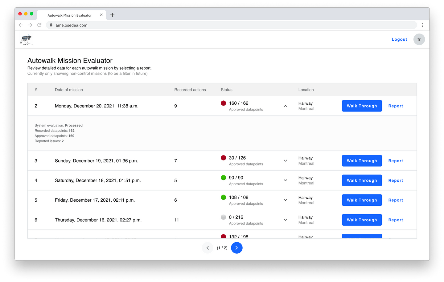
La pagination vous permet de parcourir quelques missions à la fois, et vous pouvez ajuster l'ordre en fonction des données de mission. Pour chaque mission, vous pouvez développer la ligne pour révéler plus d'informations, ou interagir avec eux pour parcourir les données via le flux « Passage en revue ».
Présentation des missions
Vous pouvez parcourir chaque point de données (datapoint) enregistré d'une mission et comparer facilement la photo prise avec son image de contrôle correspondante. À partir de cette vue, vous pouvez facilement voir l'action ou le point de contrôle d’un point de données spécifique, le temps enregistré et, dans ce cas, une description de l'angle de la caméra. Chaque action peut être nommée ou dotée d'une description pour identifier avec plus de facilité l'emplacement ou à eu lieu la capture de données.
À droite, vous avez des boutons en forme de flèches « suivant » et « précédent » qui facilite la navigation des images.
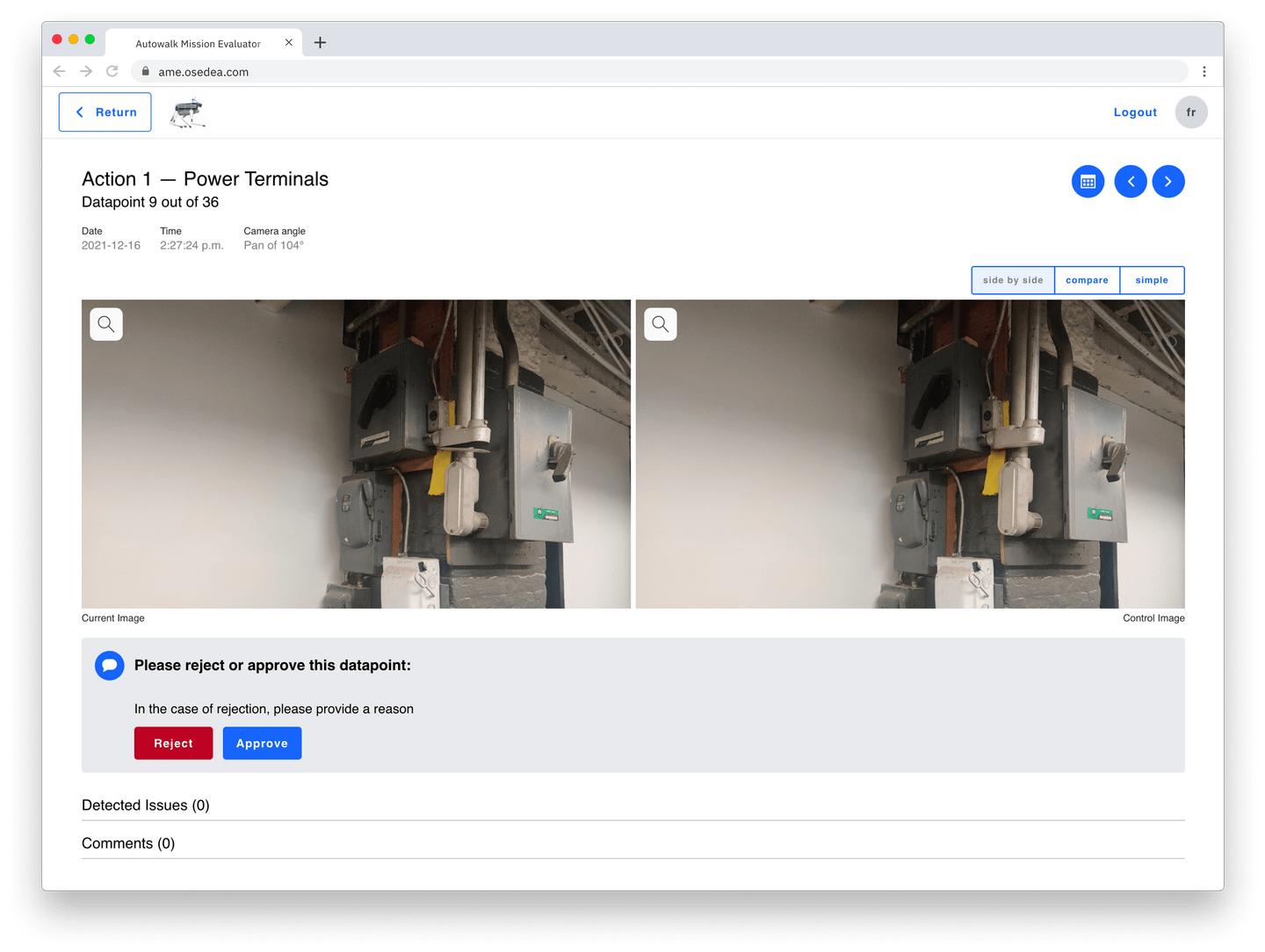
Par défaut, vous verrez l'image de contrôle vis-à-vis l'image actuelle. Alternativement, vous pouvez choisir d'afficher ces images dans un curseur de comparaison ou simplement regarder l'image actuelle si c'est tout ce qui vous intéresse.
Une fois que vous avez visualisé l'image, vous pouvez inscrire des commentaires qui seront enregistrés pour référence future. Un utilisateur peut simplement approuver le point de données et passer au suivant, ou le rejeter. Lors du rejet d'une image ou d'un point de données, nous demandons à l'utilisateur de justifier son action en expliquant son raisonnement, comme illustré dans l'exemple suivant.

Dans ces deux cas, l'utilisateur est amené au point de données suivant une fois qu'il a terminé son interaction. Cette procédure permet à un utilisateur de :
- parcourir efficacement de nombreuses images
- enregistrer efficacement leurs résultats pour qu'ils soient vus par d'autres membres de l'équipe ou par eux-mêmes.
En revisitant un point de données donné, un utilisateur verra s'il a été approuvé ou rejeté, par qui et pour quelle raison.
Rapport de mission
Alternativement, un utilisateur peut passer en revue une mission dans le flux de rapport, où chaque action (ou emplacement physique) est séparée et des aperçus de chaque point de données peuvent être observées dans la vignette, le long de l’écran, à gauche.
Un utilisateur peut sélectionner chacun d’entre eux individuellement et voir les mêmes informations concernant les points de données d'importation que dans le flux de la procédure.
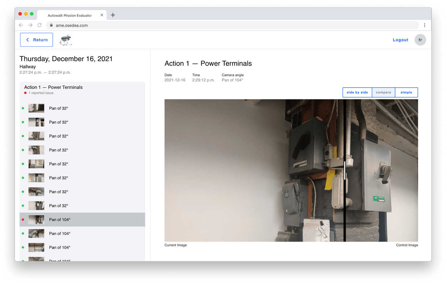
Ici, nous pouvons voir l'interface utilisateur de comparaison des diapositives d'image de contrôle par rapport à l'image actuelle, ce qui peut être utilisé pour identifier facilement les différences entre les deux images.
Ajouts à venir
Nous voyons AME comme la première étape pour offrir un outil d'évaluation universel servant à la visualisation des données collectées par Spot. Ce système peut être adapté pour d'autres sources de données telles que les résultats d'analyse, l'audio, les clips visuels ou tout autre extrait de données pouvant être affiché dans le navigateur.
Sous cette forme, l'outil que nous avons développé permet à un type d’utilisateur de visualiser les données - une sorte de modérateur - mais ce système peut être conçu pour s'adapter à différents flux et rôles d'utilisateurs afin d'aider une équipe à travailler plus efficacement. Dans l'exemple mentionné plus haut, une personne était chargée de s'assurer qu'un emplacement était correct à la fin de chaque journée. Mais si ce même utilisateur souhaite informer un membre du personnel approprié d'un problème détecté, ou le charger de le résoudre, un service de notification simple peut être introduit pour répondre à ce besoin.
Dans un monde où l'apprentissage automatique est de plus en plus présent et fiable, nous pouvons facilement implémenter un autre niveau d'autonomie à ce système en évaluant les données collectées et en permettant au système de détecter les problèmes. Ce système permettrait à un humain de passer moins de temps à analyser les données et de ne valider que les résultats du système jusqu'à ce que le modèle devienne complètement indépendant. De cette façon, nous (humains) pouvons nous concentrer sur des tâches qui ajoutent plus de valeur à nos organisations.
À votre tour!
Spot est assez cool en soi, mais sa véritable puissance réside dans la façon dont on peut le mettre à profit. Nous avons créé AME pour vous aider à vous libérer des tâches d'évaluation routinières afin que vous puissiez vous concentrer sur votre entreprise.
Si vous souhaitez en savoir plus sur la manière dont la fonction de marche automatique de Spot peut vous aider ou sur la manière dont notre outil AME peut être intégré à votre flux de travail pour automatiser la collecte de données, contactez-nous!
Trois astuces pour se remettre rapidement au code suite à une réunion

Vous avez sûrement déjà vécu une semaine remplie de rencontres, éparpillées dans votre calendrier. Peu importe leur pertinence et leur efficacité, il faut toujours prendre le temps pour revenir au travail par la suite. En fait, selon une étude de l’université de Californie Irvine, il faut en moyenne 23 minutes et 15 secondes pour se remettre à la tâche après une interruption (voici l’article complet).
Réduire le nombre d’interruptions au travail est essentiel si vous voulez atteindre un état de productivité. Une partie de la solution devrait être une solution organisationnelle dans votre équipe (moins de réunions inutiles, bloquer son calendrier pour diminuer les interruptions) préserver de larges plages de temps sans interruption). D’autres pourraient être réalisés par vous (désactivez les notifications, fermer les courriels, éviter de naviguer sur internet).
Cependant ceci n’est pas le thème principal de cet article. Nous allons aborder, non pas la façon de réduire les interruptions, mais la façon d’accélérer la récupération!
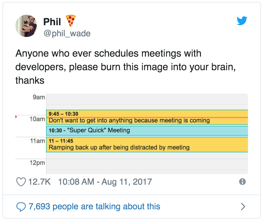
Les développeurs sont généralement frustrés d’être interrompus (au-delà des réunions) car cela nous fait perdre le fil de nos pensées…

Source : Monkey User
C’est un fait ! Des études ont montré que toute interruption avait de tels effets. Et si vous pouviez vous remettre plus rapidement à « ce que vous faisiez » ? On sait qu’on ne pourra pas se sauver des rencontres, elles vont continuer à être présentes. Par contre, nous pouvons nous préparer à mieux revenir à des tâches et d’être plus productifs plus rapidement. Au lieu de perdre 20 minutes avant et 20 minutes après, vous poseriez efficacement les bases d’un retour plus rapide au code.
Voici 3 techniques qui peuvent vous aider à le faire.
Anticipez vos interruptions et préparez vous d’avance
Si vous savez à l’avance quand l’interruption se produira, vous pouvez l’anticiper. Vous n’avez pas le contrôle sur tout, mais vous pouvez prévoir le moment de vous arrêter Si possible, arrêtez-vous lorsque vous aurez terminé une tâche concrète.
En effet, il est plus facile de se remettre à une tâche lorsque vous savez exactement ce qu’est l’étape suivante. L’élan suscité par la réalisation de la tâche facile vous aide à vous remettre au travail. Vous allez progressivement vous replonger dans le code. Une fois que vous y êtes habitué, il vous sera plus facile de vous attaquer à la prochaine tâche moins évidente.
Ceci n’est pas spécifique au code. En fait, c’est exactement ce que Ernest Hemingway conseillait pour remédier au blocage de l’écrivain :
« Je travaillais toujours jusqu’à ce que j’aie terminé quelque chose et je m’arrêtais toujours lorsque je savais ce qui allait se passer ensuite. De cette façon, je pourrais être sûr de continuer le jour suivant. » - Ernest Hemingway, Paris est une fête.
Arrêtez-vous lorsque vous savez exactement quelles seront les prochaines étapes.. Avant de partir en réunion, laissez une liste de choses à faire (TODO) dans le code pour votre retour. Cela fonctionne bien !
Si vous êtes un adepte du développement piloté par les tests (TDD, en anglais), voici une variante qui fonctionne encore mieux.
Arrêtez-vous sur un test qui ne marche pas
Le cœur du cycle de vie du TDD bat au rythme de 3 étapes :
- Rouge, écrire un test et le voir échouer
- Vert, faire passer le test avec un code adéquat .
- Réusinage de code (refactorisation), raffiner la conception sans abimer les tests.
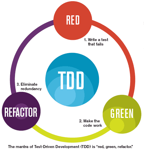
Source: Spec India
Le TDD ne se résume pas à « écrire le test en premier ». L’étape Rouge est cruciale, car elle vous oblige à réfléchir à ce qui devrait se passer ensuite. Vous exprimez votre intention dans ce que vous voulez que le code fasse. Vous faites preuve de concept sur ce que le code n'accomplit pas en ce moment.
Si vous me demandez, les étapes Verte et Réusinage sont les plus faciles. Cela ne signifie pas qu’il soit facile d’écrire « juste assez » de code ou de réusiner du code existant vers une meilleure conception. Il faut de la pratique pour le faire correctement. Mais une fois l’étape Rouge réalisée, l’étape suivante est claire : faire passer ce test.
Ainsi, le moment idéal pour arrêter de travailler est l’étape Rouge. Avant votre réunion, assurez-vous de vous arrêter une fois que vous avez écrit le prochain test. Ne le faites pas encore passer. Gardez-le pour le moment où vous reviendrez.
C’est une note pour vous-même, des instructions claires à suivre pour revenir plus vite au code.
Créez un rituel de concentration.
Cette astuce est payante à long terme. Il s’agit d’aider votre cerveau à se mettre au travail le plus rapidement possible. Un moyen efficace d’y parvenir est de créer un rituel.
Rien de magique ou de terrifiant ici. Créer un rituel signifie que vous créez une routine pour vous remettre au travail en répétant les mêmes petites étapes à chaque fois. Par exemple, certaines de ces étapes pourraient faire partie de votre rituel :
- Mettez vos écouteurs avec votre musique préférée préférés chaque fois que vous commencez une session de travail.
- Prenez trois respirations profondes et souriez avant de vous pencher sur votre clavier.
- Prenez une tasse de thé/café/eau et buvez-en une gorgée avant de vous installer.
- Levez-vous et prenez une power pose pendant une minute.
Voici mon rituel de concentration personnel depuis que je travaille à la maison :
- Je mets mes écouteurs et ma liste de lecture pour me concentrer
- J’allume de l’encens
- Je lance un chronomètre pour démarquer la période pour laquelle je souhaite travailler sans interruption
Votre rituel de concentration est personnel. Avec un peu de pratique, vous trouverez ce qui fonctionne le mieux pour vous.
En pratiquant le même rituel avant d’entamer une session de travail, vous vous entraînez à reconnaître que la session de travail qui arrive. Lorsque je mets mes écouteurs et que j’allume de l’encens à mon bureau, mon cerveau se prépare à entrer dans la zone. J’ai l’impression qu’il est plus facile de me remettre au travail après une réunion lorsque je pratique mon rituel de concentration.
Le pouvoir d’un rituel de concentration vient de la répétition. C’est une habitude. Vous vous conditionnez à être concentré et efficace dès que vous commencez vos gestes de routine.
Je vous recommande également de désactiver toutes les notifications comme faisant partie de votre rituel. Snoozez-les pour la session de travail que vous avez planifiée et éloignez votre téléphone. En général, le monde peut attendre 30 min avant d’avoir des nouvelles de vous, vous ne manquerez rien.
Remettez-vous au travail avec quelque chose de petit
Vous est-il déjà arrivé de rentrer de votre réunion, mais de lutter pour vous remettre au travail que vous aviez laissé de côté ? Pour une raison ou une autre, vous le repoussez sans cesse, vous flâniez sur Slack, surfez sur le Web, vérifiez vos courriels… Tout sauf la chose principale que vous aviez à faire.
Si vous avez du mal à vous remettre au travail, utilisez la règle des cinq minutes :
Mettez en marche un minuteur de 5 minutes et dites-vous que vous ne ferez cette tâche que pendant ce temps-là.
Lorsque vous n’arrivez pas à faire quelque chose, la solution peut être de réduire cette tâche à une version ultra facile à réaliser. Vous pouvez bien sûr n’y consacrer que 5 minutes !
Le truc, c’est que la partie la plus difficile est de commencer. Avec la règle des cinq minutes, vous rendrez cela plus facile. Il y a de fortes chances que vous continuiez à travailler après que les 5 minutes se soient écoulées !
Je trouve qu’utiliser un minuteur est très efficace. Cela aide mon cerveau à croire que je n’y consacre que 5 minutes, puis à y repenser. La plupart du temps, je décide de continuer.
Parfois, j’abandonne après 5 minutes, ce n’est pas grave, cela faisait partie du plan ! Lorsque cela se produit, je réexamine généralement mes attentes pour le reste de la journée. Peut-être que je n’ai pas l’énergie pour m’attaquer à cette tâche maintenant, et qu’il vaudrait mieux de faire un travail plus superficiel à la place. En général, cela signifie aussi que je dois faire une pause de 15 minutes loin de l’écran.
Kévin Systrom, le cofondateur d’Instagram, a désigné cette technique comme son life hack préféré. James Clear, l’auteur de Atomic Habits, a proposé une variante de 2 minutes pour lutter contre la procrastination et adopter de nouvelles habitudes. Lorsque vous n’arrivez pas à vous engager dans quelque chose, rendez-la vraiment facile à réaliser. Même si vous n’y parvenez pas, l’habitude de vous y lancer sera payante avec le temps ! De plus, il suffit généralement de se remettre au code après une pause ✌.
En conclusion
Se remettre au travail après une pause prend du temps. Vous devez changer de contexte et vous replonger dans cette tâche spécifique. Les réunions peuvent sembler exaspérantes, car elles prennent plus de temps que prévu dans le calendrier. Bien que de nombreuses réunions puissent être évitées, certaines ne le peuvent pas — sauf si vous pratiquez la programmation collective, vous devez vous synchroniser avec les personnes avec lesquelles vous travaillez à un moment donné.
Lorsque vous vous trouvez dans cette situation, quelques techniques peuvent vous aider à vous remettre au code plus rapidement :
- Si vous pouvez anticiper, arrêtez de travailler lorsque vous savez exactement ce que vous devez faire ensuite. Gardez quelque chose de facile à faire pour le moment où vous reviendrez.
- Créez un rituel de concentration, une routine qui vous aidera à vous mettre dans la zone plus rapidement.
- Si vous avez du mal à vous y mettre, dites-vous que vous n’allez y consacrer que 5 minutes. Souvent, cela suffit pour commencer. En un clin d’œil, vous en avez fini avec votre tâche !
Ces techniques fonctionnent bien lorsque vous revenez d’une réunion, mais aussi avec tout type de pause/distraction. J’aime arrêter ma journée avec un test échoué, puis commencer le jour suivant avec mon rituel de concentration - ouaip, mon encens brûle en ce moment et ma liste de lecture « Focus » passe dans mes écouteurs. 🎧
Prenez soin de vous !
Merci à Nicolas Carlo pour cette collaboration. Vous pouvez lire d’autres de ses articles sur son blogue Understand Legacy Code et le suivre sur Twitter @nicoespeon.
Si vous souhaitez découvrir d'autres conseils et astuces pour améliorer votre productivité, consultez cette section de notre blogue.
Photo : Chris Montgomery
Astuces et meilleures pratiques pour Flutter

Au cours des dernières années, Flutter a gagné en popularité. Et pour de bonnes raisons : il s'agit d'un incroyable framework de développement d'applications multiplateformes qui vous permet de créer des applications pour les appareils mobiles, Web, de bureau et intégrés, le tout à partir d'une seule base de code. L'une des principales raisons pour lesquelles de nombreuses entreprises envisagent aujourd'hui d'utiliser Flutter est notamment due au fait qu'il fonctionne dès sa mise en place, qu'il est open source et qu'il est plus facile à comprendre que d'autres alternatives, ce qui le rend idéal pour les MVP (produit minimum viable).
Je travaille avec Flutter depuis plus d'un an maintenant. Je n'avais aucune expérience préalable avec les frameworks mobiles et Flutter a été ma première plongée dans le monde mobile. Je suis une développeuse Full Stack chez Osedea avec une formation en JavaScript, j'avais une relativement bonne base pour commencer avec Dart (langage de programmation derrière le framework Flutter). Dart est un langage relativement nouveau qui compile le code source à la fois en avance (AOT) et juste à temps (JIT). Il est similaire à JavaScript, mais le SDK Dart autonome est livré avec une machine virtuelle Dart et possède son propre « package manager » appelé pub.
Voici certaines choses que vous devez savoir si vous commencez, ou envisagez de commencer à travailler avec Flutter.
Connaître la langue
Tout d'abord et le plus important c’est de connaître votre langage. Bien que Dart soit très similaire à JavaScript, vous devez tout de même connaître les bases : l’étendue des variables et des méthodes, la sécurité nulle et l'opérateur bancaire, l'opérateur clé et l'utilisation de late pour les variables non nullables. Comme JavaScript, Dart est un langage à « thread » unique, il utilise async/wait avec isolates . Les Isolates sont particulièrement utiles pour les tâches de longue durée que vous souhaitez gérer sans bloquer l'interface utilisateur. Découvrez-en plus dans la documentation officielle de Dart et comment cela s'applique à Flutter. Apprenez-le et utilisez-le s'il convient à votre projet.
Astuce : parfois, cette tâche de longue durée doit être effectuée par le backend ou un service séparé à la place.
Les widgets
Là encore, ce sont les bases, mais assurez-vous de bien les comprendre car vous les utiliserez tout le temps. Si vous avez déjà commencé à jouer avec Flutter, vous savez probablement ce que sont les widgets, avec et sans état, et à quel point il est facile de faire apparaître votre premier « Hello World » sur Android et iOS.
Assurez-vous également d'apprendre et d’explorer avec les gestures et les widget controllers. Il est également important de se familiariser avec les Layout widgets pour vous aider à créer une bonne structure dès le départ.
Suivez les mises à jour
Lorsque j'ai commencé à travailler sur le projet, nous n'avions pas encore tous les atouts de Sound Null Safety qui a été publié avec Flutter 2.0. Heureusement, l'équipe et le client étaient de notre côté et nous avons réussi à mettre à jour Flutter et à intégrer ses dernières fonctionnalités. Maintenant, nous voyons const partout dans notre code. Ce qui est formidable, car le compilateur connaît à l'avance const, il n'en conservera donc qu'une seule copie référencée à tout moment et ne la reconstruira pas. C'est là une amélioration de performances.
La mise à niveau vers la dernière version du framework, du langage et des bibliothèques utilisées peut entraîner des gains de performances, plus de fonctionnalités et, bien sûr, plus de sécurité, ne négligeons pas cela. En le gardant à jour, vous vous assurez de tirer le meilleur de Flutter, en résolvant potentiellement certains problèmes et en commençant à utiliser de nouveaux widgets. Et hé, Flutter pour le Web ça sonne excitant, n’est-ce pas ?
Quelques extras astucieux
Voici quelques éléments supplémentaires qui peuvent vous aider à gagner du temps :
- Capturer l'état de l'application : utilisez
didChangeAppLifecycleState, il capture l'état de l'application si elle est en arrière-plan ou au premier plan. Par exemple, si un utilisateur avait sa caméra ouverte pendant que quelqu'un l'appelait ou s'il changeait simplement d'avis et décidait de mettre votre application en arrière-plan. Dans ce cas, vous souhaitez probablement disposer de votre contrôleur de caméra ou arrêter et reprendre certains services en fonction de l'état de l'application,didChangeAppLifecycleStatevous permettra d'attraper cet état. - Modifier la conception de la barre d'état : utilisez
SystemChrome.setSystemUIOverlayStyle ClipRRectest idéal pour arrondir les coins. Mais pas dans tous les cas. Si vous voulez jouer avec la forme d'un conteneur, la meilleure pratique serait d'utiliser ladecoration : BoxDecoration(…)à la place. Et si vous avez besoin d'un avatar de forme circulaire, Flutter a un joli widget pour cela,CircleAvatar.
J'ai partagé mon expérience avec Flutter en espérant que cela vous à été utile! Pour d'autres trucs et astuces passionnants, consultez notre section de blogue sur le développement logiciel, et si vous avez des questions, n'hésitez pas à nous contacter!
Crédit Photo: Kelly Sikkema
Comment l'EventStorming a facilité le transfert de connaissances et la découverte d'un domaine métier complexe

Le transfert de connaissance est un défi particulier pour les entreprises dans leur parcours, peu importe la raison pour laquelle ce transfert de connaissances est requis. Dans cet article, nous partagerons notre expérience de travail avec un client confronté à un défi de transfert de connaissance majeur et comment nos compétences techniques sont venues à la rescousse. Pour remédier à la dépendance à l'égard d'une personne clé détenant la majorité des connaissances sur les processus métiers et les interdépendances des sous-systèmes à cette situation, nous avons utilisé l'EventStorming. C’est une méthode d'atelier collaborative issue de l’approche Domain Driven Design, afin de transférer et de documenter les connaissances critiques. Nous souhaitons vous outiller pour bien faire face au défi du transfert de connaissance qui peut paraître énorme et un réel casse-tête.
Le défi
Voici un petit aperçu du défi auquel notre client faisait face. L’équipe disposait d'un système d'information en place depuis plus de 10 ans. L'état du système était:
- Présence de nombreux sous-systèmes interdépendants développés à différentes périodes par diverses personnes, parfois même par des prestataires externes.
- Évolution au fil du temps, sans vision à long terme ni documentation fonctionnelle ou technique adéquate.
- Une personne clé avec 10 ans d'expérience dans l'entreprise, détenant une grande partie des connaissances des processus métiers et des interdépendances des sous-systèmes, quittait l'entreprise.
Face à ces défis, notre objectif était de transférer cette connaissance, d'autonomiser les utilisateurs et de réduire la dépendance vis-à-vis de l'assistance technique.
Notre méthodologie et approche
Nous avons adopté une approche méthodique comprenant quatre étapes clés.
- Phase de découverte: nous avons commencé par une présentation à haut niveau des sous-systèmes et du cycle de vie d'un produit, fournie par le client. Ensuite, l’équipe a examiné les documents existants et participé à des discussions avec le responsable du service TI pour mieux comprendre le modèle d'affaires et les processus métiers critiques.
- Phase d'écoute et de documentation des problèmes: consistait d’observation de l'équipe TI lors de la résolution des problèmes courants et analysé l'historique des erreurs pour identifier les problèmes les plus fréquents. Notre rôle était de documenter les solutions et de faciliter la communication entre l'équipe TI et les utilisateurs.
- Ateliers EventStorming: ont constitué le cœur de notre approche. Ils ont permis d'explorer de manière collaborative les processus métiers complexes et d'identifier les interdépendances entre les sous-systèmes. Ces ateliers ont favorisé la participation de tous les acteurs impliqués, sans nécessiter de connaissances techniques particulières.
- Finalisation et mise à l'épreuve de la documentation: une fois les ateliers terminés, nous avons regroupé toutes les informations et les avons organisées dans un outil de documentation interactif. Nous avons ensuite testé la documentation en vérifiant si les utilisateurs étaient devenus autonomes dans leurs tâches quotidiennes.
L'EventStorming : c'est quoi?
L'EventStorming est une méthodologie de découverte collaborative de domaines métiers complexes. Créée par Alberto Brandolini (sommité du domaine) en 2012, elle s’assure de la présence de toutes les parties prenantes pour arriver à des solutions. Elle s'inscrit dans la conception pilotée par le domaine (Domain Driven Design) et peut être utilisée à différentes étapes d'un projet. Les avantages d’utiliser l’EventStorming sont nombreux incluant une résolution rapide et efficace et une collaboration engageante.
Concrètement, l'EventStorming repose sur l'utilisation de post-it pour matérialiser le domaine étudié. Les participants identifient les événements clés et les placent chronologiquement sur une timeline. En affinant cette représentation, ils identifient les causes et les effets des événements, ce qui permet d'obtenir une vue détaillée des processus métiers.
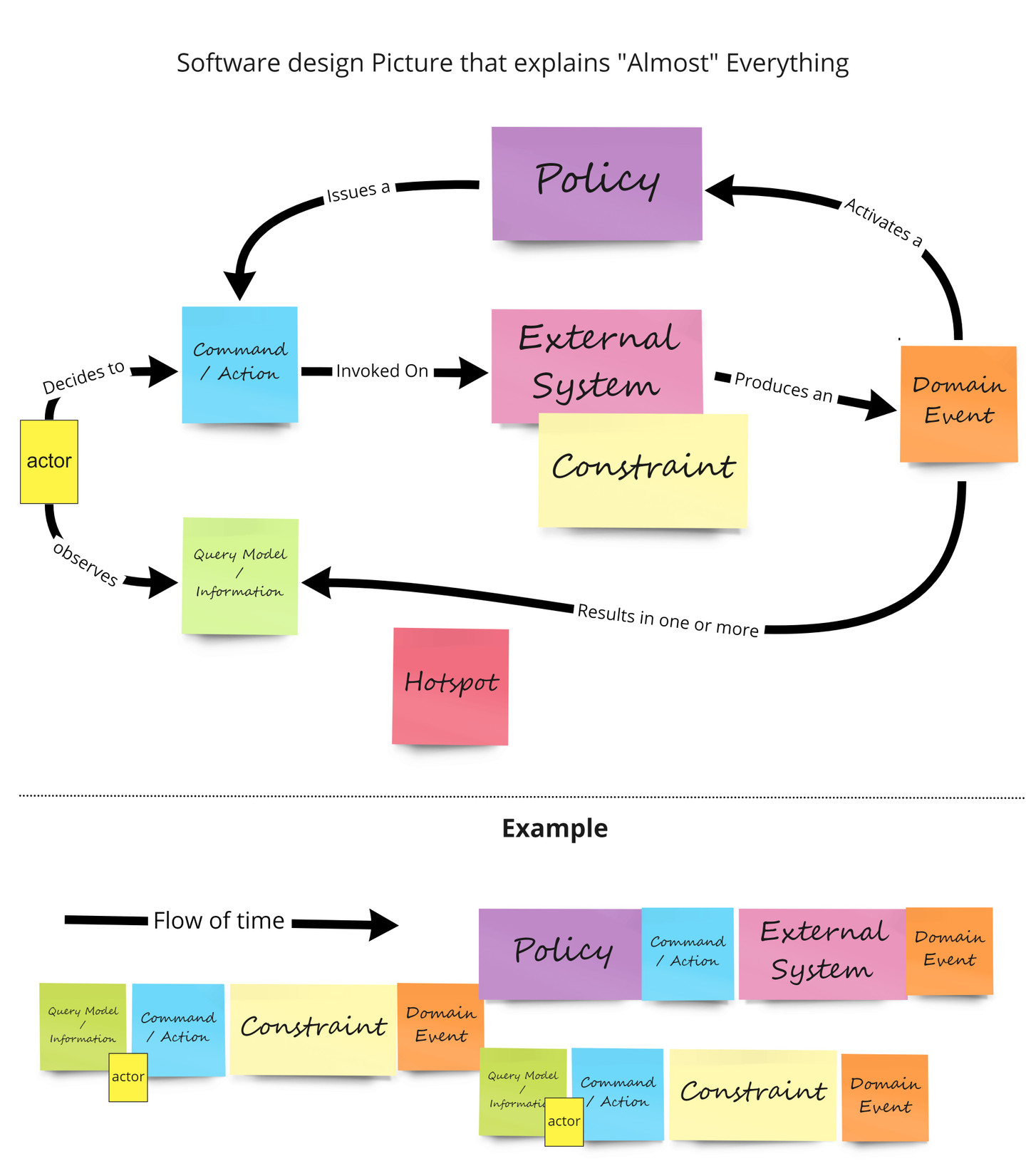
Alberto Brandolini, Source
Quels sont les résultats de l’EventStorming?
Avec l’EventStorming, nous avons pu obtenir des résultats significatifs dans le cadre de notre mandat. Les différentes séances d'EventStorming nous ont permis de visualiser les principaux processus métiers et les flux logiciels associés. Nous avons pu affiner les flows, éliminer les redondances et identifier des pistes d'amélioration à court, moyen et long terme.
Avoir regroupé toutes les informations dans un outil de documentation interactif a facilité le transfert de connaissances et rendu les utilisateurs du système d'information plus autonomes dans leurs opérations quotidiennes. De plus, l'approche collaborative de l'EventStorming a favorisé le partage des connaissances entre les différents acteurs du projet.
Nos points importants à retenir
Le transfert de connaissances nécessite du temps dédié et une approche neutre pour redéfinir le vocabulaire et les processus métiers. L'EventStorming s'est révélé être une méthode efficace pour explorer et documenter les processus métiers complexes, dans le contexte de transfert de connaissance. Il a permis de représenter visuellement les interactions entre les sous-systèmes et d'identifier les problèmes potentiels. En favorisant la participation de tous les acteurs impliqués, ces ateliers ont créé un environnement propice au partage des connaissances et à l'amélioration continue.
Une approche pilotée par le domaine avec la méthodologie de l'EventStorming s'est avérée être un outil précieux pour explorer un domaine métier complexe de manière collaborative, faciliter le transfert de connaissances et identifier des pistes d'amélioration. En adoptant cette méthode, nous avons permis à notre client de renforcer sa résilience face aux départs de membres clés de l'équipe et de se concentrer sur l'amélioration continue de son système d'information. Je vous invite à considérer l’EventStorming dans vos futurs défis, et n’hésitez pas à communiquer avec nous pour échanger ou avoir plus d’informations.